

The Atlanta
Symphony Orchestra
Symphony Orchestra
Proposed identity for the Atlanta Symphony Orchestra
Classical music gets a bad rap. Not just because most of its luminaries and legends are long gone but because classical music has yet to break free from its "stuffy" roots.
This also applies to those organizations that play classical pieces for the masses as well. Their logos are either nondescript wordmarks or ultra-abstract forms that come across as more of an experiment than an identity.
This is where we thought that could change. An identity for a revered classical music orchestra that has a dynamic logo that not only identifies the organization through lettering but also provides a small history lesson through the style in which the letters are designed and combined.
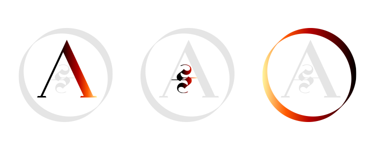
The basic idea of the logo was to tell a three part story via the interlocking elements of the design. For instance, the 'A' represents the standard aspects of classical music while the inner 'S' references classical music's more historic tradition. These are all encompassed by a dynamic ring (the 'O') that represents the newer movement and future of this timeless musical artform.
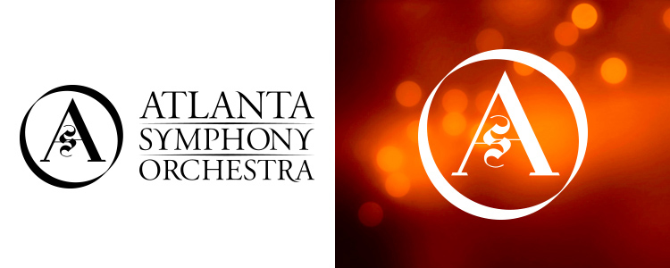
Identity in black and white with stacked wordmark.
Even it its stationary form, this identity has its own dynamism when paired with active backgrounds.