

DCA.net
Power of IP Campaign
Power of IP Campaign
Identity for DCANet's VoIP promotional initiative and collateral material.
Although this logo looks relatively simple, it was really a challenging lesson in color theory, formatting for various media and printing techniques. But most importantly, it helped to convince the client (upper management) that collaborations with in-house design teams can have eye-catching appeal while also being cost effective.

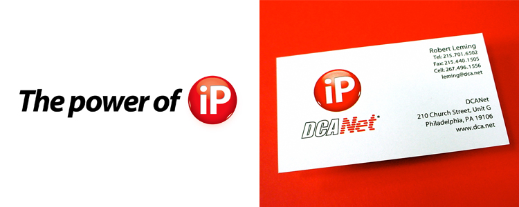
Secondary identity applications featured the "Power of iP" wordmark and identity.
Revised business cards for employees and consultants.
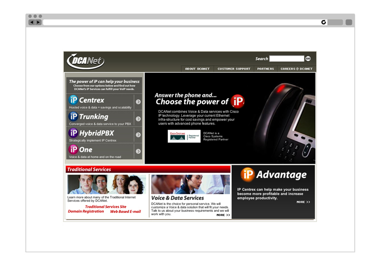
More lessons were learned from this site as well...especially how online marketing, eye catching multimedia, up-to-date design elements and vast amounts of promotional information can all be housed in one 800 by 600 pixel template.
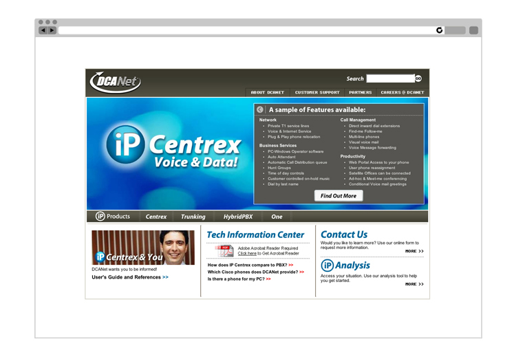
Secondary internal webpages provided more information to those curious about the "iP" suite of services.